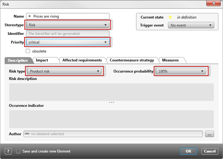
Combobox (Control)
Use the drop down menus to see the selection possibilities. Define the items offered here in the properties of the stereotype <<Requirement>>.
Click left in the toolbox on ComboBox and drag the control elements into the form. As soon as the control element is placed, the properties open on the right.
Properties
Frequently used
This category displays frequently used controls, properties, and options for each control. You cannot edit the category.
General
| Content | Use the drop-down menu or the […] button to select a property. The properties that are offered depend on the stereotype that was specified when the form was created. The values of the property are then offered as a selection in the ComboBox. |
| Enabled | Select here if the ComboBox can be edited or if it is only visible. It is marked by default. If the ComboBox is deactivated, it will be displayed in faded grey. If the setting is deactivated, the default value is shown but can’t be changed. If the setting is activated, then the value is shown and can be edited. |
| Error message | If you have specified that the control is a required field, you can enter a message here that is displayed later in the form if no value is selected for the control. |
| Mandatory | Select this option if you want the control to be a required field. The form cannot be saved until a value is selected. |
Label
Labelling can be placed right, left, bottom or top the ComboBox . It is shown on theleftby default. It is also possible to show multiple labels. Click on the arrow behind an orientation to get more properties for the label.
Links
| Alignment (horizontal) | Determines the text alignment within the control. The text can be left, right oder centered. |
| Alignment (vertical) | Determines the text alignment within the control. The text can be top, bottom, or centered. |
| Label | Here you enter a label that is displayed as a name in the form. The label can be created in two languages. You can also specify whether the label is displayed in bold, italic, or bold and italic. |
| Bold/Italic | The text can be formatted here. |
| Visibility | Use the drop down menu to select whether the label should be Visible, Hidden or Collapsed. |
| Visible | The entered label will be shown. |
| Hidden | The entered label will not be shown. The space that was taken by the label remains visible. |
| Collapsed | The entered label will not be shown. The space that was taken by the label is hidden. |
Layout
Alignment
Confirm here if the ComboBox should be placed vertically or horizontally inside the container (blue frame).
| Horizontal | |
| Left | The ComboBox will be placed on the left. |
| Right | The ComboBox will be placed on the right. |
| Center | The ComboBox will be centered. |
| Fill | The ComboBox will take up all the available space. |
| Vertical | To turn the configuration to a vertical orientation, Cell/vertical has to be set onfilled. If automatic is set, then a vertical orientation will not be shown. |
| Top | The ComboBox will be placed under the previous element. |
| Bottom | The ComboBox will be placed at the bottom. |
| Center | The ComboBox will be centered. |
| Fill | The ComboBox takes the maximum available space. |
Size
Calculation Using the dropdown menu, select whether the values entered – which are entered under Width and Height – refer exclusively to the control or whether the label should be included in the calculation.
Height/ Width Here you can enter values for height and width in px. If the fields remain empty, the width and height are calculated automatically. The width is calculated from the actual available space.
Cell
Enter here how much space the ComboBox should take up vertically and horizontally.
| Auto | The ComboBox takes the minimum available space. |
| Fill | The ComboBox takes the maximum available space. |
Display
Visible Use the ComboBox to confirm whether the ComboBox should be shown or hidden in the form. The space that the ComboBox takes remains visible.
Miscellaneous
Tooltip Enter a tooltip here to be shown when the ComboBox is hovered over.
