Form Designer
The form designer is an integral part of the tool. It launches when the Open checkbox is marked at when creating a new form. If you would like to edit the form with the form designer, then you can call up the form designer with the command Design on the context menu of the form. You can also double click on the form.
Form designer interface
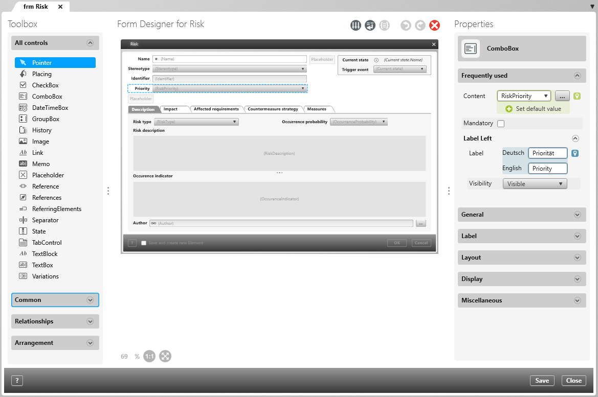
The form designer opens in the middle screen by default and is divided into three areas.
Toolbox
The toolbox is located on the left side. Here you can put different control elements like text fields, tabs, buttons, control boxes or drop down menus into the form.
All controls This area displays all (stereotype-related) controls that are available in the Form Designer.
Common Here you will find the controls that are most frequently used in a form.
Relationships Here you will find controls to which you assign relationships rather than properties.
Arrangement Here you will find controls that can be used to design the layout in a form.
Context specific Here you will find controls that are only available for certain stereotypes. For example, the TestSteps control is only available if you have created the form for test cases.
Form Designer for […]
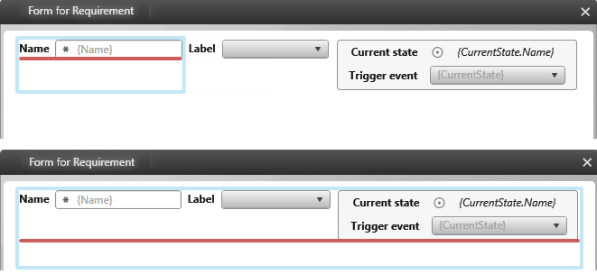
In the middle, the form will be opened. In the top area you can see the buttons with which you can, for example, delete the control elements, undo or redo your actions or influence the wrapping of control elements.
Properties
As soon as a control element is placed, the properties will open on the right side. There you can define the titles, contents or insert pictures and customize the fonts, sizes and alignments.
The view
The following buttons can be used in the form designer:
Controls:
- CheckBox
- ComboBox
- DateTimeBox (Date field)
- GroupBox (Group)
- History (Historie) Version 6.1 and higher
- Image (Image)
- Link (single link)
- Links (Links) Version 8.4 and higher
- Memo (Text editor)
- Placeholder (Placeholder)
- Reference (single reference)
- References (References)
- Referring Elements (Referencing elements)
- Separator (Dividing line)
- State (State container)
- TabControl (Tab)
- TextBlock (Simple text box)
- TextBox (Input field)
- Variations (Variations)

