Image (Control)
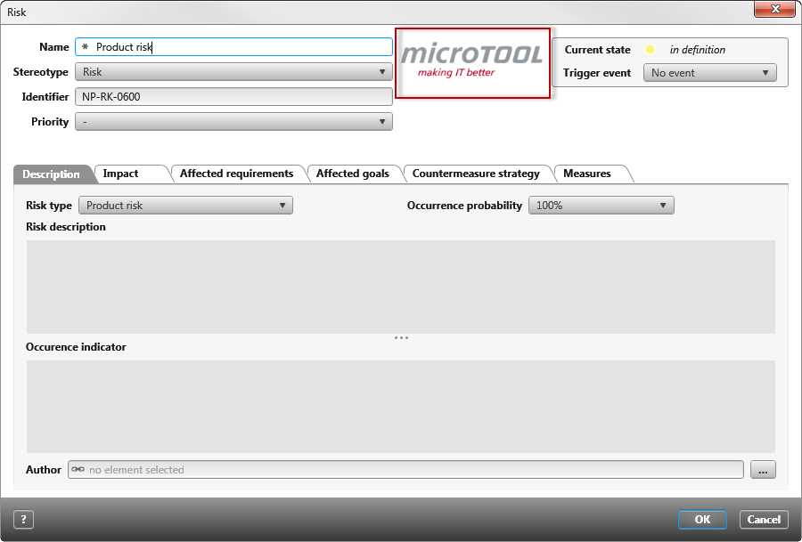
You can use the Image control to display static or dynamic images in forms.
Click Image on the left side of the toolbar and drag the control into the form. Once the control is placed, the properties open on the right.
Properties
Frequently used
This category displays frequently used controls, properties, and options for each control. You cannot edit the category.
General
| Enabled | This determines whether the image can be exchanged in the form or is only visible. The option is selected by default. If the image is deactivated, it is displayed grayed out. |
| Picture | Here you can define an image source for the image. You can specify a static image by clicking on the […] button. Dynamic images can be defined using the gray dot by selecting a corresponding source property. |
| Scale | The image is adjusted horizontally to the size of the control. |
| Show border | Select the option to display a border around the image. |
Label
You can place labels on the left, right, above or below an image. It is also possible to specify more than one label. Labels that you want to display must be made visible. Depending on where you want to place a label, you must click on the arrow behind Bottom, Left, Right, Top to display further properties for the label.
| Alignment (horizontal) | Determines the text alignment within the control. The text can be Left, Right, or Center. |
| Alignment (vertical) | Determines the text alignment within the control. The text can be aligned up, down, or centered. |
| Label | Here you enter a label, which is displayed to you as a name in the form. The label can be created in two languages. You can also specify whether the label is displayed in bold, italic, or bold and italic. |
| Bold/ italic | Here you can format the text that you have entered under Label/ Label. |
| Visibility | Use the dropdown menu to select whether the label should be Visible, Hidden, or Collapsed. |
| Visible | The label entered is displayed. |
| Hidden | The label entered is not displayed. The space occupied by the label remains. |
| Collapsed | The entered label is not displayed. The space occupied by the label is also not displayed. |
Layout
Alignment
Here you determine how the image should take its place horizontally or vertically within the container (blue frame).
| Horizontal | |
| Left | The image is aligned to the left. |
| Right | The image is aligned to the right. |
| Center | The image is aligned in the middle. |
| Fill | The image occupies the entire available space. |
| Vertical | If you want to make settings for vertical alignment, you must set the value under Cell/ Vertical to Fill. If you select Auto, no vertical alignment will be displayed. |
| Top | The image is aligned under the previous item. |
| Bottom | The image is aligned at the bottom. |
| Center | The image is aligned in the middle. |
| Fill | The image occupies the entire available space. |
Cell
Here you determine how much space the image should occupy horizontally or vertically.
| Auto | The image occupies the minimum available space. |
| Fill | The image occupies the maximum available space. |
Size
Calculation Using the dropdown menu, select whether the values entered – which are entered under Width and Height – refer exclusively to the control or whether the label should be included in the calculation.
Height/ Width Here you can enter values for height and width in px. If the fields remain empty, the width and height are calculated automatically. The width is calculated from the actual available space.
Display
Visible Use the check box to specify whether the image should be displayed or hidden in the form. The space occupied by the image remains.
Miscellaneous
Tooltip Here you can enter a tooltip that is displayed as soon as you move over the image in the dialog. The tooltip can be created bilingually.
