TabControl (Control)
You use the TabControl control to create a container in which you can place additional controls. The TabControl can contain several tabs and thus serves as a subdivision of different contents for an element.

Click TabControl on the left side of the toolbox and drag the control into the dialog. As soon as the control is placed, the properties open on the right. The properties of a TabControl are divided into TabControl and TabPage. The TabControl contains the properties of the container. The TabPage contains the properties for the content to be displayed in the TabControl.
Properties
Frequently used
This category displays frequently used controls, properties, and options for each control. You cannot edit the category.
TabControl
General
| Enabled | This determines whether the TabControl can be edited or is only visible. The option is selected by default. If the option is deactivated, the TabControl is displayed grayed out. If the TabControl contains several TabPages and you deactivate this option, you cannot switch between the individual TabPages. |
Layout
Alignment
Confirm here if the TabControl should be placed vertically or horizontally inside the container (blue frame).
| Horizontal | |
| Left | The TabControl will be placed on the left. |
| Right | The TabControl will be placed on the right. |
| Center | The TabControl will be centered. |
| Fill | The TabControl will take up all the available space. |
| Vertical | To turn the configuration to a vertical orientation, Cell/vertical has to be set onfilled. If automatic is set, then a vertical orientation will not be shown. |
| Top | The TabControl will be placed under the previous element. |
| Bottom | The TabControl will be placed at the bottom. |
| Center | The TabControl will be centered. |
| Fill | The TabControl takes the maximum available space. |
Cell
Enter here how much space the TabControl should take up vertically and horizontally.
| Auto | The TabControl takes the minimum available space. |
| Fill | The TabControl takes the maximum available space. |
Size
Height/ Width Here you can enter values for height and width in px. If the fields remain empty, the width and height are calculated automatically. The width is calculated from the actual available space.
Display
Visible Use the check box to specify whether the TabControl is to be displayed or hidden in the form. The space occupied by the TabControl remains.
TabPage
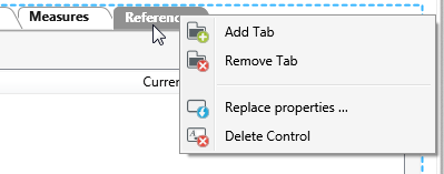
You create additional tab pages by right-clicking. To do this, click on the TabControl and choose Add Tab in the context menu.
General
Header Specify here which name is to be displayed in the individual tab page. If you have more than one tab page, select them first in the form. The labels for the individual tab pages can be created in two languages.
Display
Visible Use the check box to specify whether the TabPage is to be displayed or hidden in the form
Miscellaneous
Tooltip Enter a tooltip here to be shown when the TabControl is hovered over.
To set content and exchange content, use the Place Properties button located in the title bar of the TabPage control.