Version 7.0.1 and higher
Assigned Staff (Control Element)
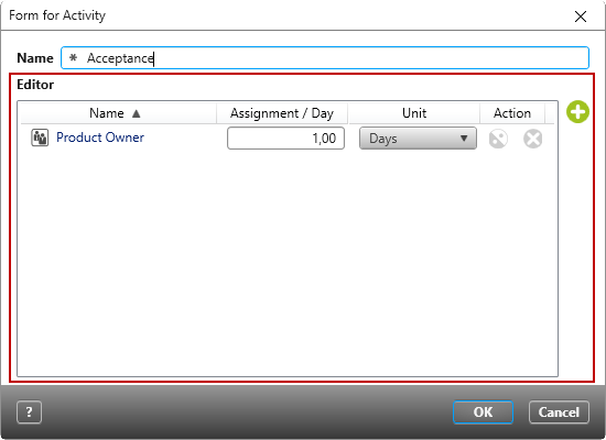
The control element for Assigned staff allows you to view and assign project groups or project staff via an activity form.
This option is only available when you select Activity as the stereotype when creating the form. In the form, you can replace the Unspecified Staff entry with actual persons and groups.
On the left side of the toolbox, under All Controls or Context specific, click Assigned staff and drag the control element into the form. Once the control element has been placed, the properties open on the right.
Properties
Frequently Used
This category displays frequently used options and properties for each control element.
General
| Enabled | Determine here whether or not the control element should be displayed. This option is selected by default. Once the option is disabled, the control element is greyed out from the form |
Label
You can place labels to the left, right, above or below an image; it’s possible to apply multiple labels. In order for labels to be on display, they also need to be made visible. Depending on where you want to place a label, you must click on the arrow behind Bottom, Left, Right, Top to display further properties for the label.
| Alignment (horizontal) | Determines the text alignment within the control element. The text can be placed to the Left, Right, or in the Center. |
| Alignment (vertical) | Determines the text alignment within the control. The text can be aligned up, down, or centered. |
| Label | Here you enter a label, which is displayed to you as a name in the form. The label can be created in two languages. You can also specify whether the label is displayed in bold, italic, or both. |
| Bold/ italic | Here you can format the text that you have entered under Label/ Label. |
| Visibility | Use the dropdown menu to select whether the label should be Visible, Hidden, or Collapsed. |
| Visible | The label entered is displayed. |
| Hidden | The label entered is not displayed. The space occupied by the label remains. |
| Collapsed | The entered label is not displayed. The space occupied by the label is also not displayed. |
Layout
Alignment
Here you determine if the image should be placed horizontally or vertically within the container (blue frame).
| Horizontal | |
| Left | The control is aligned to the left. |
| Right | The control is aligned to the right. |
| Center | The control is aligned in the middle. |
| Fill | The control occupies the entire available space. |
| Vertical | If you want to make settings for vertical alignment, you must set the value under Cell/ Vertical to Fill. If you select Auto, no vertical alignment will be displayed. |
| Top | The control is aligned under the previous item. |
| Bottom | The control is aligned at the bottom. |
| Center | The control is aligned in the middle. |
| Fill | The control occupies the entire available space. |
Cell
Here you determine how much space the control should occupy horizontally or vertically.
| Auto | The control occupies the minimum available space. |
| Fill | The control occupies the maximum available space. |
Size
Calculation Using the dropdown menu, select whether the values entered – which are entered under Width and Height – refer exclusively to the control or whether the label should be included in the calculation.
Height/ Width Here you can enter values for height and width in px. If the fields remain empty, the dimensions for width and height are generated automatically. The width is calculated from the actual available space.
Display
Visible Use the check box to specify whether the control should be displayed or hidden in the form. The space occupied by the control remains.
Miscellaneous
Tooltip Here you can enter a tooltip that is displayed as soon as you move over the control in the dialog. The tooltip can be created bilingually.
