CheckBox (Control)
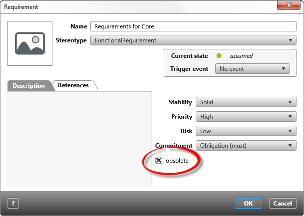
User-defined properties and project settings can be activated and de-activated with the checkbox. Checkboxes in the tool are two-state auto checkboxes. That means the status can only be either marked or unmarked.
Click on the left in the toolbox and drop the control CheckBox into the form. As soon as the control element is placed, it will open the properties on the right.
Properties
Frequently used
This category displays frequently used controls, properties, and options for each control. You cannot edit the category.
General
| Checked | Select here if the CheckBoxcan be edited or if it is only visible. This option is marked by default. |
| Enabled | Select if the CheckBoxin the dialog should be marked by default. |
| Label | Enter the text here that should be shown on the right of the checkbox. The standard name CheckBox will be overwritten. Above the grey point/select source properties, the properties can be selected. |
Label
Labelling can be placed right, left, bottom or top the CheckBox. It is shown on the left by default. It is also possible to show multiple labels. Click on the arrow behind an orientation to get more properties for the label.
Links
| Alignment (horizontal) | Determines the text alignment within the control. The text can be left, right oder centered. |
| Alignment (vertical) | Determines the text alignment within the control. The text can be top, bottom, or centered. |
| Label |
Here you enter a label that is displayed as a name in the form. The label can be created in two languages. You can also specify whether the label is displayed in bold, italic, or bold and italic. |
| Bold/Italic | The text can be formatted here. |
| Visibility | Use the drop down menu to select whether the label should be Visible, Hiddenor Collapsed. |
| Visible | The entered label will be shown. |
| Hidden | The entered label will not be shown. The space that was taken by the label remains visible. |
| Collapsed | The entered label will not be shown. The space that was taken by the label is hidden. |
Layout
Alignment
Confirm here if the CheckBox should be placed vertically or horizontally inside the container (blue frame).
| Horizontal | |
| Left | The CheckBox will be placed on the left. |
| Right | The CheckBox will be placed on the right. |
| Center | The CheckBoxwill be centered. |
| Fill | The CheckBox will take up all the available space. |
| Vertical | To turn the configuration to a vertical orientation, Cell/vertical has to be set onfilled. If automatic is set, then a vertical orientation will not be shown. |
| Top | The CheckBox will be placed under the previous element. |
| Bottom | The CheckBox will be placed at the bottom. |
| Center | The CheckBox will be centered. |
| Fill | The CheckBox takes the maximum available space. |
Size
Calculation Using the dropdown menu, select whether the values entered – which are entered under Width and Height – refer exclusively to the control or whether the label should be included in the calculation.
Width/Height
Enter the values for the height and width inpxhere. If the fields stay empty, then the height and width will be automatically calculated. The width is calculated from the actual space that is available. If nothing is entered here, then a standard height of 20px will be used.
Cell
Enter here how much space the CheckBox should take up vertically and horizontally.
| Auto | The CheckBox takes the minimum available space. |
| Fill | The CheckBox takes the maximum available space. |
Display
Visible Use the CheckBox to confirm whether the CheckBox should be shown or hidden in the form. The space that the CheckBox takes remains visible.
Miscellaneous
Tooltip Enter a tooltip here to be shown when the CheckBox is hovered over.
