State (Control)
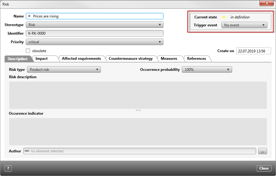
The State control is a container that contains a state machine. It displays the current state, its icon and a dropdown menu for the state change.
Click State on the left side of the toolbar and drag the control into the form. Once the control is placed, the properties open on the right.
Properties
Frequently used
This category displays frequently used controls, properties, and options for each control. You cannot edit the category.
General
| Enabled | You use this to specify whether the status in the form can be changed or is only visible. The option is selected by default. If the option is deactivated, the container is displayed grayed out. |
Layout
Alignment
Confirm here if the control should be placed horizontally inside the container (blue frame).
| Horizontal | |
| Left | The control will be placed on the left. |
| Right | The control will be placed on the right. |
| Center | The control will be centered. |
| Fill | The control will take up all the available space. |
Cell
Enter here how much space the control should take up horizontally.
| Auto | The control takes the minimum available space. |
| Fill | The control takes the maximum available space. |
Display
Visible Use the checkbox to confirm whether the control should be shown or hidden in the form. The space that the control takes remains visible.
