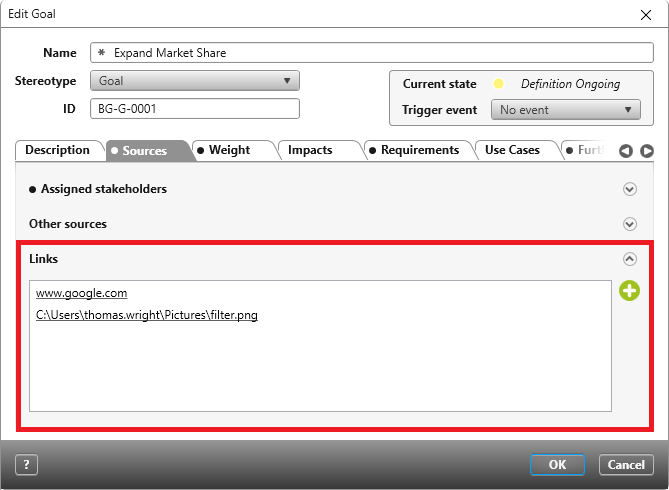
Links (Control Element)
Version 7.4 and Later
The Links section, which is found in the Sources tab of editing dialogs for requirements and goals, allows you to add external links to those dialogs. Use the green Plus button on the right-hand side of the field to add a link. Links open in their allocated applications.
Add the Links control element to forms by selecting it from the toolbox in the form designer and placing it into the form. The control element’s properties will be displayed on the right-hand side.
Properties
Frequently Used
This category displays frequently used controls, properties, and options for each control. This category cannot be edited.
General
| Enabled | This option specifies whetherthe control is displayed as active or inactive in the form. By default, the option is checked so that the user can add links to the form using the plus button. If the control is only to be used for displaying elements, do not check this option; the control will be displayed as a grey field in the form. |
Label
Labels can be placed to the right, left, bottom and top of the control element. By default, it’s displayed on the left-hand side.
It’s possible to have multiple labels displayed for the same control element.
Links
| Alignment (horizontal) | Determines the text alignment within the control. The text can be displayed to left, right or centre. |
| Alignment (vertical) | Determines the text alignment within the control. The text can be displayed at the top, bottom, or centre. |
| Label | Here you enter a label that is displayed as a name in the form. The label can be created in two languages. You can also specify whether the label is displayed in bold, italic, or bold and italic. |
| Bold/Italic | The text can be formatted here. |
| Visibility | Use the drop down menu to select whether the label should be Visible, Hidden or Collapsed. |
| Visible | The entered label will be displayed. |
| Hidden | The entered label will not be displayed. The space that was taken up by the label remains visible. |
| Collapsed | The entered label will not be displayed. The space that was taken up by the label is hidden. |
Layout
Alignment
Specify here if the control element should be placed vertically or horizontally inside the container (blue frame).
| Horizontal | |
| Left | The control will be placed on the left. |
| Right | The control will be placed on the right. |
| Center | The control will be placed in the centre. |
| Fill | The control will take up all the available space. |
| Vertical | To configure the control element with a vertical orientation, Cell/ Vertical has to be set to Fill. If it is set to Auto, a vertical orientation isn’t possible. |
| Top | The control will be placed under the previous element. |
| Bottom | The control will be placed at the bottom. |
| Center | The control will be placed in the centre. |
| Fill | The control takes up the maximum available space. |
Size
Calculation
Using the dropdown menu, select whether the values entered – which are entered under Width and Height – refer exclusively to the control element or if the label is also included in the calculation.
Width/Height
Enter here the height and width dimensions as px values. If you leave the fields empty, the dimensions are calculated automatically. The width is calculated according to the amount of space available and the default height of 20px is used.
Cell
Enter here how much space the control should take up vertically and horizontally.
| Auto | The control element occupies the minimum available space. |
| Fill | The control element occupies the maximum available space. |
Display
Visible Decide here if the control element should be displayed or hidden in the form. Even when hidden, the space the control element would otherwise take up remains empty.
Miscellaneous
Tooltip Enter here the specifications for a tooltip if desired.
