View “Earned Value Analysis“
The Earned Value Analysis is a graphic analysis that you can create for an activity to see whether it is still on schedule, whether additional costs will be incurred and which state it is in. The Earned Value Analysis can be used for classic as well as agile and hybrid projects. The calculation of Earned Value depends on how you plan your activities – classic or agile. You can set the calculation for each activity on the Calculation tab page under Earned Value Analysis.
The dialog can be opened:
- via the context menu of an activity with the Earned Value Analysis command.
The view
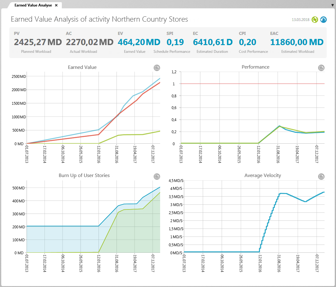
Indicators
In the upper part of the view, you see various key figures that give you information about the status of your project. Below this, four diagrams are displayed that show you the progress of your project graphically.
Planned Value
The Planned Value (PV) indicator shows you the planned expenditure of an activity or project that must be met by the current point in time.
The planned costs are calculated:
PV = Days since beginning of activity/Activity duration x Planned value of activity
The terms planned costs, actual costs, and estimated costs come from the classic Earned Value Analysis. objectiF RPM enables agile/hybrid Earned Value Analysis in addition to classic analysis. The calculations use the planned workload entered for the activities and deliver the results as planned workload, actual workload and estimated workload.
Actual costs
The Actual Costs (AC) indicator represents the expense of an activity incurred to date. The actual cost is calculated from the planned cost of the activity and not from the time recording. The actual effort is specified in person days. For a value to be displayed, the current time line must not be before the start of the activity.
The actual expenditure for activities is calculated:
AC = Days since beginning of activity/Duration of activity x planned workload of activity
The actual expenditure for activities with partial activities is calculated:
AC = Total workload of partial activities
Further values are then calculated from the planned effort, the earned value and the actual effort, which show you how the project – based on the current values – will develop further.
Scheduled Performance
The Schedule Performance Index (SPI) indicator shows you whether the activity is on schedule or behind. In order for the value to be calculated, the activity must have started, have a planned workload, and the current date must not be before the activity starts.
SPI = EV/PV
This results in a value that is interpreted as follows:
SPI = 1 You are exactly on schedule.
SPI > 1 You are working faster than planned.
SPI < 1 You are working slower than planned.
Estimated Duration
The Estimated Duration (EC) indicates how many days it is likely to take to complete the activity or project if work continues at the current rate. The Estimated Duration is expressed in days.
EC = Duration of Activity/SPI
If the completion valueat the current point in time is 0, objectiF RPM also displays 0 for the Estimated Duration indicator.
Cost Performance
The Cost Performance Index (CPI) shows you whether the project or activity is still on schedule with regard to the planned workload or whether you need to adjust to higher expenses.
CPI = EV/AC
This results in a value that can be interpreted as follows:
CPI = 1 Current costs are the same as the planned costs.
CPI > 1 You have less costs than planned.
CPI < 1 You have more costs than planned.
Estimated Workload
The Estimated at Completion (EAC) indicator shows the calculated cost of an activity or project if work continues at current levels of efficiency. If you compare the value with the planned effort, you can see whether the effort of the activity/project will increase. The estimated workload is expressed in person days.
EAC = PV/CPI
If the completion value at the current point in time is 0, objectiF RPM also displays 0 for the estimated workload indicator.
Earned Value
The Earned Value (EV) indicator shows how much of the activity – starting from the planned cost up to the current point in time – has actually been implemented. The earned value depends on the calculation type set. You can plan activities “Classic, progress from percentage completed“, in which the activities are calculated using a fixed percentage. The progress can be calculated in four different ways, which you must specify for each activity. If you have set the calculation “Agile, progress from completed requirements” for activities, the workload of the assigned requirements are totaled and compared with the completed workload of the requirements and a percentage value is determined. The completion value is given in person days.
EV= Workload of an activity x percentage progress
Charts
The charts compare the planned values with the actual values and thus show you whether you are still within your plans or not.
Chart “Earned Value”
This chart shows the planned effort (blue line), the actual effort (red line), and the earned value (green line) of an activity. In this way, you can make a statement about the possible end date of the activity and see whether you are in the time and cost plan.
The x-axis displays the duration of the activity. All efforts of the scheduled requests are summed up and displayed in person days on the y-axis.
The blue line shows the planned effort and serves as a guideline. You use it as a guide and see whether you are in the plan. The red line stands for the actual effort, and shows you how much employee effort (costs) has been required up to the current point in time. So how much work has been done on the activity to date? The green line shows you how much of the planned requirements have already been completed at this point in time.
Chart “Performance”
In this diagram, you can see how efficiently the activity is carried out in terms of planned workload and time.
The x-axis indicates the duration of the activity. On the y-axis there is a scale from 0 to 1.2, where 1 is the target value. The red line with a value of 1 is the plan line to see whether things are running according to plan. The blue line shows the SPI value (time efficiency) and the green line the CPI value (cost efficiency).
In principle, you can use both indices – SPI and CPI – to make a statement on how the activity will develop in terms of duration and workload if it is processed consistently. If the lines are above the red line – the value is greater than 1 – then the activity will probably be completed faster and cheaper than originally planned. If the lines are below the red line – the value is less than 1 – then costs will increase and completion will be delayed. Or it might be finished faster than planned and have more costs (workload) at a certain point in time, because two extra employees are included. In this case, the blue line is above the red line and the green line is below the red line. The inverted case is also possible. Work is slower but cheaper because there are only two people working on an activity instead of the planned four. Then the cost efficiency line is above the red and the blue line below the red.
Chart „Burn Up of User Stories“
The Burn Up Diagram compares the planned requirements with the completed requirements and shows how the planned earned value relates to the actual value. The diagram is particularly useful if you want to display the changing scope of requirements and at the same time see how many requirements have already been completed.
The x-axis displays the duration of the activity. All efforts of the scheduled requests are summed up and displayed in person days on the y-axis.
The blue line rises when additional requests are assigned to the activity and falls when requests are rescheduled. The green curve rises when requests are processed – that is, when they have reached their final state. If the green line is on the blue line, all planned requirements are implemented. If the green line is below the blue line, work is slower than planned.
Chart „Average Velocity“
You can use this chart to determine the average processing speed of an activity. Use the diagram, for example, to analyze the performance of a team at the beginning of a project in order to decide whether more employees are needed, the sprint length must be adjusted or the average effort of an activity must be reduced or increased.
The average speed is calculated: Average speed = sum of the workloads of all previous sprints / number of sprints
They have a sprint duration of 10 days (2 weeks) and a workload of 30 PT per sprint. In the first sprint, requirements were met with a total workload of 25 PT. The average speed is therefore 25 PT per sprint. In the second sprint the achieved value is only 5 PT. As a result, the average speed dropped to 15 PT after two sprints.
Calculation of the Classic Earned Value Analysis
The project progress percentage is calculated from the cumulative progress of all activities defined in the project. The calculation of the classic Earned Value Analysis is then calculated as follows:
If you choose the calculation type Activity: % complete, the progress entered for the activities is used to calculate the performance value. You can enter or track the progress of an activity in its properties dialog.
For the two calculation types Fixed Percentage : 25/75 Rule and Fixed Percentage : 50/50 Rule, the progress of activities with 25% and 50%, respectively, is included in the calculation as soon as it changes to a processing state.
With the calculation type Fixed Percentage : 0/100 rule, only the progress of activities that have already been completed (with 100 %) is included in the calculation.
The Earned Value of a project is calculated according to the following formula: Earned Value (EV) = planned costs (cumulative) * project progress percentage (cumulative).