Cumulative Flow Diagram
In addition to the Dashboard, the Cumulative Flow Diagram is another view that gives you a quick overview of the editing state of your requirements.
Create Cumulative Flow Diagram
- Select the Create other/ Cumulative Flow Diagram command from the context menu of a package.
- Name the diagram and select a context element. You can select the project, an activity or a package.
- Under Show, determine whether the total number or the total workload of the requirements is displayed.
- Use the […] button to assign states to the individual areas.
Multiple selection is possible when selecting states. States that have already been used are no longer displayed in the list.
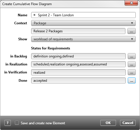
- Click OK to create the diagram.
Open Cumulative Flow Diagram
A Cumulative Flow Diagram can be opened by double-clicking on it.
The view
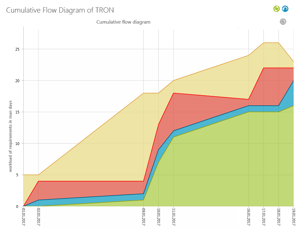
In the upper part of the view you see the name Cumulative Flow Diagram of TRON. This consists of the diagram type – Cumulative Flow Diagram – and the name of the selected context element – TRON. Below – slightly smaller – is the name you entered when creating the view.
If you are already familiar with this type of diagram, you will see whether development is going according to plan and when implementation will come to a standstill. First look at the shape. This will tell you whether or not the work is going well. The more jagged, the worse it is going. There can be various reasons for this: Holidays, vacation and other things blocking progress. Not only can you see that things are going badly, but you can also see how long the blockade is taking and to what extent it has affected other work steps.
What the diagram shows
The y-axis shows the number or effort of the requests and the x-axis shows the (daily) data points. In other words, the vertical axis displays the total effort or the number of requirements from the context element. The horizontal axis shows a time axis.
At the beginning the diagram shows two entries on the time axis: the zero point and the current data point. Each time the graph is opened, a new data point is created (but only one per day). Or, if one has already been created using the Task Manager, the datapoint is updated.
Open the diagram for the first time and see a white area in front of you. There may be two reasons for this: Either there are no requirements in the specified context, or you have set the Workload of Requirements when configuring the diagram and your requirements have no Effort. Check this by running the Edit command on the diagram.
At the beginning of a project you will probably only see a beige area representing the existing requirements. Only when you start editing the requirements do the individual curves rise and approach the upper limit of the backlog. The backlog area increases as requirements are added and decreases as requirements are removed from the backlog. If the backlog does not change, the line remains unchanged.
The vertical distance between the individual lines shows how many requirements are currently being processed in this area. You should always keep an eye on the distance between the individual areas: Large distances between the individual areas indicate that work in an area may not be fast enough or that employees are missing. But even if lines do not continue to rise and remain flat, this indicates a work stoppage. The reasons for this can be very different and are mostly related to the way the projects work. If you capture, implement and test requirements linearly, you will see a stair-like gradient in the diagram. If you work in parallel instead, the lines should approach.
Data Points
As soon as you open the diagram, a new data point is created on the time axis – indicated by the current date. The data point contains the “current” states of the requirements and displays them using colored lines. Using the graphic, you can now see how many requirements are in which state range. Alternatively, you can move the mouse over an area to see the information.
If you want to regularly create data points for the diagram, create a Calculate Cumulative Flow Diagram task. Alternatively, you can open the view every day to create a data point.
Lines
The diagram evaluates requirements with regard to their processing status, which are assigned to the following four areas: Backlog, Development, Test and Acceptance. In the legend, they are called in Backlog, in Realization, in Verification and Done.
When creating the diagram, determine which states are to be assigned to the individual areas with a list.
At the top right, there are two buttons for updating the view and deleting existing data points.
| |
Updates the diagram. If you want to update the diagram manually after changes have been made, click the button. |
| Legend | |
| Data points are deleted from the diagram. You should only use them if you really want to start the calculation again. |
The data points are not saved in the view, but on the context element. If you have created more than one Cumulative Flow Diagram with the same context element, the data points are also deleted there.
If requests are being edited while you have the diagram open – i.e. when the state changes or the workload is adjusted – these changes will not be displayed until you click the Refresh calculation button. A new data point will not be created.
To maintain consistent visual depiction, you can create a task that automatically updates the graph at regular intervals.
Context menu commands
The following context menu commands are available for the diagram:
Edit
Opens the editing dialog in writing mode.
Share
Allows you to send the chart by link, email or hyperlink.
Open
Opens the diagram.
Go to Definition (Topic bar)
In the Products window, jumps to the diagram storage location and marks it there.
Delete
Deletes the diagram from the project. This action cannot be undone.