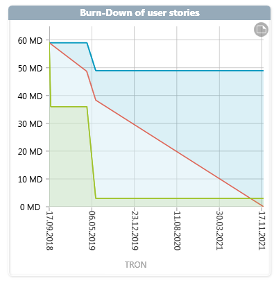
Diagram “Burn Down”
The Burn-Down diagram is very similar to the Burn-Up diagram. However, here the completion curve runs from top left to bottom right. The red line, which runs from top left to bottom right, shows the amount of effort required to meet the requirements in order to stay on schedule. It is also possible to see when the requirements were implemented.
You create the analysis in the dashboard
- within a group by clicking on the plus button, choosing Create new Chart and selecting Burn-Down in the following dialog under Chart kind