Diagram “Burn-Up”
The Burn-Up diagram compares the planned requirements with the completed requirements and shows how the planned completion value relates to the actual value. The diagram is particularly useful if you want to display the changing scope of requirements and at the same time see how many requirements have already been completed.
You create the analysis in the dashboard
- within a group by clicking on the plus button, selecting Create new Chart and selecting Burn-Up in the subsequent dialog under Chart kind.
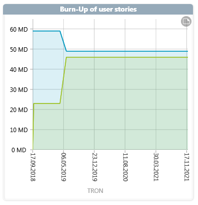
The x-axis shows the duration of the activity. All efforts of the scheduled requirements are summed up and displayed in person days on the y-axis.
The blue line shows the planned requirements and the green line shows the completed requirements. The line rises when further requests are assigned to the activity and falls when requests are de-planned. The green curve rises when requirements are processed – that is, when they have reached their final state.
If the green line is on the blue line, all planned requirements are implemented. If the green line is below the blue line, work is slower than planned.