Diagram “Performance”
In this diagram, you can see how efficiently the activity is carried out in terms of planned effort and time.
You create the analysis in the dashboard
- within a group by clicking on the plus button, choosing Create new Chart and selecting Performance in the subsequent dialog under Chart kind
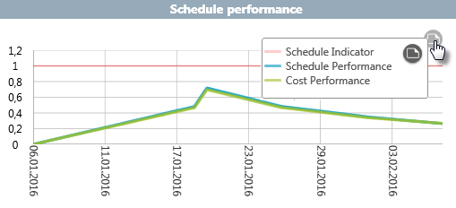
The x-axis shows the duration of the activity. The y-axis shows a scale from 0 to 1.2, where 1 is the target value. The red line with a value of 1 is the plan line, on which you orientate yourself and see if you are in the plan. The blue line shows the SPI value (time efficiency) and the green line the CPI value (cost efficiency).
In principle, you can use both the SPI and CPI indexes to make a statement about how the activity will develop in terms of duration and effort if it is processed consistently. If the lines are above the red line – the value is greater than 1 – then the activity will probably be completed faster and cheaper than originally planned. If the lines are below the red line – the value is less than 1 – then costs will increase and completion will be delayed.
It can also happen that you are finished faster than planned at a certain point in time and have caused more costs (efforts), because you move in with 2 more employees instead of the planned 2. In this case, the blue line is above the red line and the green line is below the red line. The inverted case is also possible. They work slower, but at a lower cost, because the requirements are not met by four of the scheduled people, but only by two people who cost even less. Then the cost efficiency line is above the red and the blue line below the red.